
If you need a clean, reliable presence fast, a shell scheme is hard to beat. The trick isn’t “more panels” or “more copy”—it’s clarity: a layout that never blocks the aisle, graphics you can read from 3–5 meters, and a one-minute flow that ends in a scan, booking, or sample. For a turnkey option with layouts and pricing guidance, see Shell Scheme Booth.
What you really get (and what you don’t)
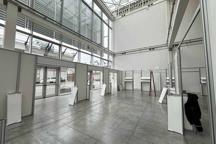
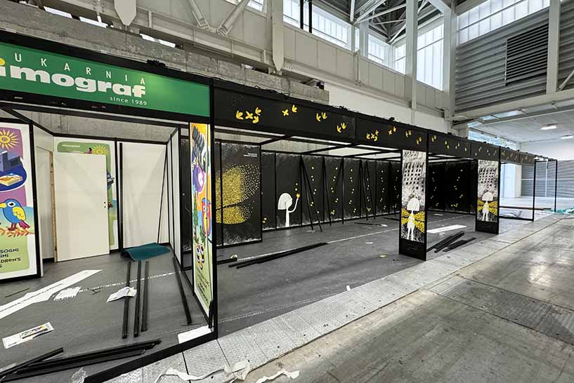
A shell package usually includes aluminium uprights, infill panels, a fascia header with your name, basic spotlights, and often carpet. Heights are commonly capped around 2.4 m, with panel widths near 1 m—always confirm the panel map in your exhibitor manual. You typically don’t get: brand graphics, furniture beyond a basic table/chairs, upgraded lighting, power beyond minimal sockets, or storage beyond what you add yourself.
Field note: Shell walls are not structural. Heavy items, suspended features, or large screens may require organiser approval or alternative supports.
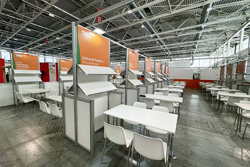
The layout that doesn’t fight footfall
Exhibitions reward stands that feel easy to enter and quick to navigate. Think like a traffic engineer.
- Keep the entrance open. Don’t park a counter on the front line; push it to a side wall to avoid creating a “bouncer effect.”
- Face the diagonal on corner plots. People cut corners—point your primary message where the eyes naturally travel.
- One-minute path. Hook (claim/visual) → demo (proof) → next step (scan/booking/sample). If a visitor can’t see the path in three seconds, you’ll lose them.
- Storage kills clutter. A lockable cupboard or a branded counter with shelves keeps giveaways, cases, and cables off the deck.
- Quiet zone for conversations. Even a small stool and side table behind the main flow doubles your chances of meaningful chats.
Micro-case: the blocked front
A SaaS exhibitor placed a reception counter across the entrance “to welcome visitors.” Result: queues formed in the aisle; passers-by diverted. After moving the counter to the left wall and adding a floor arrow to the demo screen, dwell time doubled, and scans rose 38% day two.
Storage and logistics costs for the modular booth
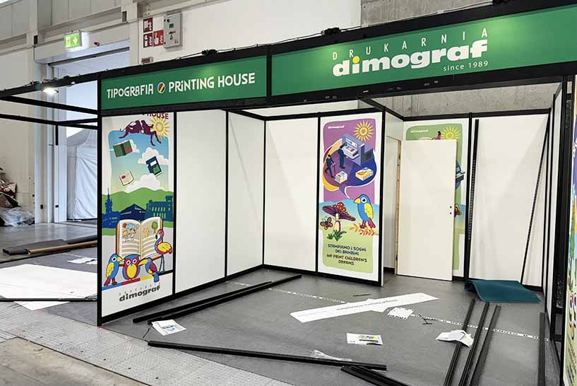
Your graphics are a billboard, not a brochure.
- One claim, one hero visual. If someone can’t repeat your big idea after three seconds, it isn’t big enough.
- Contrast over decoration. Print your artwork in black-and-white; if the claim dies, adjust.
- Hierarchy beats fine print. Headline (6–10 words) → subline (a short proof) → CTA (scan/book).
- Mind the seams. Request the panel splits from your printer so faces and headlines don’t get cut across joints.
- Place the CTA at eye height. A QR to a dedicated show landing with a specific promise outperforms generic home-page links.
Lighting and AV that actually help
- Layer light. Basic spots are rarely enough. Add warm spots for demos; consider a backlit fabric frame if the organiser allows.
- Avoid glare on screens. Angle lamps away from monitors; matte floor tiles reduce reflected hotspots.
- Cable discipline. Tape routes along the perimeter and pass under counters where possible; trip hazards are conversion hazards.
Costs & where budgets leak
Your organiser package is step one; the real variation is in add-ons and timing.
- Printed graphics (panels, fascia wrap, cupboard doors)
- Flooring (foam-backed carpet or tiles), furniture, AV
- Additional sockets, internet, and out-of-hours labour
- Freight to venue, on-site storage, and handling fees
Pro tip: Lock artwork and power plans ≥ 4 weeks out. Last-minute reprints, rush surcharges, and evening installs create the leaks most teams feel but rarely forecast.
Budgeting ballpark
Think in tiers rather than absolutes:
- Lean: organiser package + simple panel graphics + basic counter and stools.
- Balanced: add a backlit frame, quality flooring, branded storage, and two small screens.
- Impact: layered lighting, larger screens, custom counter, and a lightbox wall.
Staffing and the one-minute script
Even great layouts underperform without a repeatable conversation.
- Hook (10–15 s): “We [outcome] without [pain] in under a minute—want a quick look?”
- Demo (30–40 s): touch once, show one number moving, or one clear before/after.
- Next step (10–15 s): “Scan for the spec and book a slot,” or “Grab a sample and a two-page buyer’s guide.”
Print the script and stick it inside the counter. Consistency beats charisma at a noisy show.
Checklist (printable)
- Panel plan (width × height, count, door size) confirmed
- Power map (sockets, exact locations, load limits) confirmed
- Artwork tested in B/W; no text across seams
CTA visible at eye height; - QR to a dedicated show landing
- Storage: lockable cupboard or counter with shelves
- Daily reset: wipes, bin liners, spare tape, fresh collateral
When to graduate from shell to custom/modular
Move beyond shell when you need:
- Distinct architecture that competitors can’t replicate.
- Heavy product staging or integrated demo furniture.
- A multi-show programme where reusability and brand impact justify a modular or bespoke build.
If you’re exploring upgrades or need a turnkey plan now, talk to Shell Scheme Booth for a layout, panel map, and a no-surprises budget.